I’ve previously written about achieving the mobile web standard and avoiding assumptions about mobile users. Completing the mobile trilogy, here’s some advice for turning the whole thing on its head and thinking mobile first.
Earlier this year I went down to Birmingham for the annual Building Perfect Council Websites event, hosted by Socitm Insight and E-Government Bulletin. I had been asked along to talk about mobile – leading a group discussion reflecting on what we actually mean when we talk about “mobile users” and also delivering a quickfire talk at the end of the day, urging the audience to “think mobile first“.
Here’s a summary of what I said…

All the evidence points to a huge increase in mobile web browsing
We all know that more and more people are using mobile devices to access the web.
All the research points to a global trend towards mobile browsing, with some predicting that mobile browsing could overtake desktop browsing globally as early as next year. It’s already done so in India.
SOCITM’s Website Performance Service tells us that about a quarter of visits to council websites now come via mobile devices, yet this year’s Better connected report from Socitm found that only 15% of sites passed our new mobile standard – leading them to publish a briefing urging councils to improve their mobile offering.
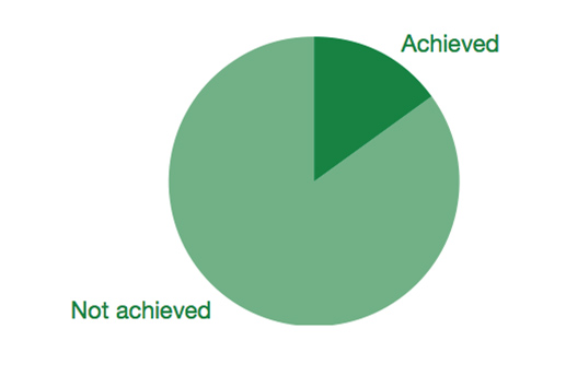
Councils still have a way to go to serve their mobile citizens online
It’s worth noting that Better connected 2014 will have a far greater focus on mobile browsing:
This year we will integrate the mobile survey into the main survey, and carry out more tasks using smartphones (eg iPhone, Android). For the first time in Better connected each reviewer will be able to assess the mobile experience alongside the desktop for each council. It also means that for the first time four star rankings will take account of the mobile experience.
Socitm Insight
We know that councils are at different stages of developing their mobile offering, but whatever stage you’re at, I have a key tip to help you cater for this growing audience – that is, to think mobile first.
Years ago, web professionals came up with the idea of graceful degradation – basically, this meant designing your all-singing all-dancing website with all its whistle and bells, but then using various techniques to try to take account of less capable devices and browsers.

One problem with doing things this way round is that we’re now seeing some sites simply hiding content and functionality from mobile devices – often this causes more harm than good, especially when we remember than some users may currently only access the Internet on their mobile.
For example, if something is important enough to be on the desktop site, why deprive mobile users of it? Or to put it another way, if it’s not essential to mobile users, do desktop users really need it either?
This brings us to another approach – progressive enhancement. This revolves around focussing on the core purpose of your site – making sure all the fundamentals can be used regardless of device. This means you’re not excluding anyone by removing potentially important elements, and are more ready for whatever new devices may come along in future.

You can then, by all means, enhance the experience for those with bigger screens and more powerful processors, but because you’ve already sorted the essentials, you know you’re not leaving anyone behind.
In summary, then – some top tips for thinking mobile first are…
- Get the basics right
- Keep it simple and task focussed
- Declutter and get rid of anything superfluous
- Don’t rely on technologies that not all devices can access (e.g. PDFs)
- Be ready for the future…
I was also interviewed on the day by the nice folk at The Information Daily – here’s what I had to tell them:
If you’d like to hear me talk more on mobile, you can see me on day two of Socitm 2013 in London, 10 December.
Cover photo of mobile devices by Michael Sohn/AP, as featured in the Guardian.